Start Display
Matisse's The Snail 1953
An audio description of Matisse's The Snail, followed by an account of how it was made
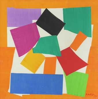
At first, this huge multi-coloured work nearly 10 feet square behind glass looks like an abstract arrangement of irregular geometric blocks of vibrant colour on a white background. But it’s quickly apparent that six of the blocks are arranged around a central dark green one in a loose spiral. They fan out like fat spokes from a wheel - starting top centre with a black rectangle and moving in an anti-clockwise direction all the way round to the top right corner. This work is in fact called ‘The Snail’. From the top black rectangle, moving anti-clockwise, the colours are dark mauve, yellow, orange, and red - finishing with a thinner orange rectangle pointing up towards the top right corner like a snail’s eye-stalk. In each of the four corners is another block – top left pale mauve, bottom left a long horizontal bright blue rectangle, bottom right pale green and top right dark green. The whole design is surrounded by a jagged orange border – and on that in the bottom right corner it says in red handwriting ‘H Matisse 53’.
Close to, it’s clear that the work is a kind of collage. The almost-straight and curving edges of the shapes are sometimes sharp, sometimes rough - telling us that they’ve been part cut and part torn from a sheet of thick painted paper. Each has then been placed on a white paper background, slightly overlapping and overlapped by its neighbours. The border seems to have been made up of leftover pieces of an orange-painted sheet – the straight edges against the frame the edges of the original sheet, and the inner edge jagged where chunks have been cut out. Overall many of the shapes have fold-lines and scuffing - and parallel streaks of varying pigment intensity revealing the direction of the paintbrush. The paper of the long blue rectangle bottom left, for example, was painted in a vertical direction, while that of the border to the left of it has horizontal marks. And the paint coverage is patchy, with the paper bubbling up where a wetter area has dried. All these imperfections give the work a sense of spontaneity and playfulness.
It’s hard to believe ‘The Snail’ was created when Matisse was eighty-four, a year before he died. Although he was confined to his bed or wheelchair he was feeling liberated and energized by a new technique he’d developed - cutting direct into pre-painted paper without preliminary drawings. He called these works ‘cutouts’ rather than collages because the act of cutting, with the resistance of the thick paper, was fundamental to the design. He used big scissors like shears to, as he put it, carve direct into colour like a sculptor. With these final works, Matisse believed he had achieved a greater completeness and abstraction than ever before, saying ‘I have attained a form filtered to its essentials’.
On the bottom blue rectangle – in its top right corner - are clues as to how ‘The Snail’ was assembled - pinprick holes with the white background showing through. Matisse’s secretary Lydia Delectorskaya watched ‘The Snail’ being made.
Lydia Delectorskaya (Female voice):
Matisse always had at his disposal sheets of paper painted in gouache by assistants, in all the colours he used. A background of white paper was put on the wall and the assistant pinned onto it the pieces of gouached paper which Matisse passed to him, indicating exactly where they should be placed. When Matisse decided that his composition was finished, it was lightly stuck to the background. When it was sent to be pasted down, before anything was moved, an extremely precise tracing was made to ensure that no changes were made in the composition, not even by so much as a millimeter.
Room 8: Cecilia Vicuna and Joseph Beuys
Beuys's Lightning with Stag in its Glare 1958–85
An audio description of Beuys's Lightning with Stag in its Glare, followed by the artist's thoughts about the power of art
This huge installation consists of an assortment of mostly dull brown objects like industrial detritus from an abandoned mine or metal-workings on the floor in an area about 25 feet square – dominated by a 19 and a half foot high triangular shape like a witch’s hat, suspended at an angle across the far corner from the centre of a horizontal girder about 5 feet above it. The triangle’s sharp tip, bending slightly into the corner, is wiggly, like a guttering flame, and its base just touches the floor. Its surface is lumpy and pitted, like baked earth. While we’re exploring this work the best place to be is facing the triangle.
About 5 feet in front of the triangle is a kind of silver go-kart. An ironing-board shape rests on axles connecting four hollow blocks - wheel-like except each is on its side and sliced into a part-wheel segment. Two are semi-circular and two are just quarters. Arranged around this are 34 sausage or spiral shapes like squirts from a giant toothpaste-tube, the biggest as long as your forearm and others no larger than a hand. Some look like root vegetables and others like fruit with a stalk. Over towards the far long wall is a small trolley with three real wheels. And in the bottom left of the installation is a tripod on which is a one foot four inch cube the same texture and colour as the triangle, with pottery shards embedded in it. On top of that, in the centre, is a shiny circular object an inch in diameter.
This sculpture is called ‘Lightening with stag in its glare’ – and it was created by the German artist, teacher, politician and activist Joseph Beuys between 1958 and 85. It may seem modern and abstract, but it was inspired by the exact opposite. Each element has a precise symbolic function. The triangle, cast in bronze, represents a bolt of lightning striking the ground and illuminating a group of animals. For Beuys it embodies the raw energies of the earth – and his fascination with materials which generate, store and transmit that power. Bronze conducts electricity – with the added advantage for a sculptor that it fills in the finest details of a mold. Beuys cast the bolt from a section of a mound of clay – direct therefore from the very earth itself. This mound had, incidentally, formed part of an installation near the Berlin Wall in 1982 – its summit the same height as the top of the Wall. You may be interested to know that this gallery is twice the height of most of the galleries in Tate Modern – the ceiling 23 feet above the tip of the bolt.
The silver-coloured kart - aluminium to suggest the flash – represents the stag. In northern European mythology the stag is endowed with spiritual powers – and in Beuys’s work it symbolizes protection. Here it’s protecting the squirts and blobs – primordial organisms from the opposite end of the evolutionary scale. The stag may also be a warning reminder of a time when mankind worshipped the elemental forces we now mistakenly believe we can control. The three-wheeled trolley represents a goat. And on the tripod cube – also cast in bronze from soil – the circular object is a real compass pointing to magnetic north – again reflecting Beuys’s concern with the planet’s energies.
Beuys believed in the revolutionary power of art, and for him materials like those here were a metaphor for the creative forces in all of us which can heal society.
During the Second World War Beuys was a Luftwaffe radio operator. He described how he was shot down over the Crimea and then rescued by nomadic Tartars who nursed him back to health by rubbing his burned and frozen body with fat and wrapping him in felt. Later fat and felt were among the materials which often featured in his sculptures. He said in an interview:
Beuys (Male voice)
‘… when I built up a kind of theory and a system of sculpture and art and also a system of wider understanding – anthropological understanding of sculpture being related to the social body and to everybody’s life and ability - then such materials seemed to be right and effective tools to overcome, one could say, the wound of us.’
In the Studio: International Surrealism
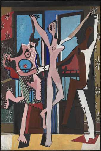
Picasso's The Three Dancers 1925
An audio description of Picasso's Three Dancers, followed by the story that inspired him to paint it
This thickly-painted Picasso oil 7 feet high and 4 and a half wide in predominantly blue, pink and black interlocking jagged shapes is taken up by three contrasting naked figures holding hands in a frenzied dance. Behind, rectangles of vibrant blue indicate a pair of balconied floor to ceiling French windows with sky and maybe sea beyond. The positions of the dancers’ arms and legs tell us they’re dancing in a ring, but the image has little sense of depth.
Against a central vertical of dark blue sky where the windows have been pushed slightly open, a simple, elongated figure in pale pinks stands on one straight leg with the other bent up at the knee - simultaneously facing us and moving towards the right with jutting breast in profile - head back and arms flung up in a V of ecstasy or supplication.
On the left is another pink figure, also on one straight leg, moving in the same direction. But the other leg is kicked up behind, and the head is arched back at an almost impossible angle towards that heel. This figure is a complicated jumble of different shapes. The face, twisted to stare at us is like a wild mask or skull, with black almond-shaped eye-sockets and red gash mouth with sharp white fish-like teeth. A patch of green with parallel diagonal white lines and patches of other colour with black dogtooth surround may indicate a skirt. On this is a blue oval with vertical black line – like a hole through which the background blue and balcony are visible. At chest-level is a larger ‘hole’, an upside-down teardrop with a central red circle – like a breast. Above are two more breast-like shapes - following the line of the figure’s contorted body and left arm as it stretches up to join hands with one of the hands of the central figure. The top breast is a black rounded silhouette against the blue with big nipple like a doorknob, facing right. This woman’s other arm reaches behind the back of the central figure to link hands with the third figure – on the right side of the work.
This third dancer is moving in the opposite direction, right to left, and in contrast with the others is made up of three vertical angular stripe-like blocks in black, white and dark brown. With left arm vertical this dancer holds hands in the top right corner with the central figure, making a triangular space between the arms - painted black, like a pointed hat. In the centre of this is a small brown helmet shape in profile facing left. But the black triangle suggests a bigger head enclosing the first. At the top of the ‘hat’, either side of the point, black lines with rounded ends like violin pegs - where Picasso has indicated the spaces between the fingers of the two hands - suggest the bobbled or belled tassels of a pierrot or harlequin. And at the bottom left of the triangle is the silhouetted profile of a long-nosed face.
Picasso made this work in 1925 when he was married to Russian ballerina Olga Khoklova, a dancer with Diaghilev’s Ballets Russes. It’s thought to relate to a tragic episode in his life from twenty-five years earlier. We know he kept it for forty years – and the lumpy surface suggests repeated overpainting - evidence perhaps of the extent to which the episode continued to obsess him.
‘The Three Dancers’ started out as a relatively straightforward representation of a dance rehearsal. But X-rays have revealed that Picasso then made radical changes. While he was working on it he heard of the death of an old friend Ramon Pichot. Pichot and another artist, Carlos Casagemas, had accompanied Picasso on his first trip to Paris in 1900. In Paris, Casagemas had fallen in love with a woman called Germaine. But she rejected him, and in a fit of passion Casagemas took at shot at her before killing himself. Soon afterwards Germaine married Pichot. This painting seems to tell the story of that tragic love triangle. In a dance of love, sex and death the woman on the left is Germaine, arching her back to avoid the red spot – possibly the bullet; the central figure is the victim Casagemas, and the figure on the right is Pichot - linking hands behind Casagemas’ back with Germaine.
In the Studio: Gerhard Richter
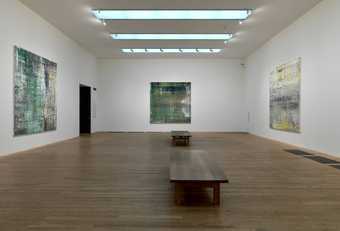
Richter's Cage 2006
An audio description of Richter's Cage paintings
The six cool, abstract 9 and a half feet square paintings regularly spaced around the walls of this white room were made by Gerhard Richter in 2006 as a coherent group. All six are multi-coloured, but two are predominantly grey, two grey and green, one grey and red - and one grey, yellow and white. Horizontal and vertical textures in the blurred colours where the thick paint has been dragged across and down the canvas suggest reflections in the surface of a river – particularly where there are deep greens.
Close to, areas of both smooth and pitted paint reveal that the works have been built up in successive layers. The deeper the ‘pit’ the greater the variety of contrasting colours. After application each layer has then been scraped back with a big palette knife - removing some paint completely and smudging the colours left behind. Another layer has then been put on top, scraped back – and so on. So the works have developed in unanticipated ways. They’re a bit like a billboard where, in preparation for a new set of posters being stuck on, the latest have been ripped off - revealing fragments of hundreds of past posters beneath. Richter has said ‘I don’t know what I want; … I like the indefinite, the boundless; I like continual uncertainty’.
Richter called these works ‘Cage paintings’ after the American avant-garde composer John Cage. Cage introduced elements of chance into the creation and performance of his music, and is best known for his pieces for prepared piano – a piano with sound-altering objects placed on the strings – and his composition ‘four minutes 33 seconds’ - performed without a single note being played so that the random sounds of the environment can be heard. Richter shares this interest in what is revealed by absence or removal. The ‘Cage paintings’ have been made as much by destroying as by creating.
The paint here was applied with a large squeegee brush - so there are none of the distinctive expressive marks characteristic of Abstract Expressionism. The surface is scored in places, but these gouges too have an anonymous feel. Richter’s concern is always with the image itself – rather than direct references to anything else – and with the continuous process of questioning.